


Basic Table
Basic Table
The basic table in Bootstrap is created using the <table> element with the .table class. This class adds basic styling like borders, padding, and hover effects to make the table look clean and organized.
Bordered Table
A bordered table in Bootstrap is created by adding the .table-bordered class to a <table>. This adds borders around all the table cells, making each row and column more distinct.
| ID | Product | Price | Date Added | Stock Status | Action |
|---|---|---|---|---|---|
| 01 | Wireless Headphones | $150 | Oct 12, 2023 | In Stock |
|
| 02 | Smartphone | $999 | Oct 10, 2023 | Out of Stock |
|
| 03 | Laptop | $1,200 | Oct 5, 2023 | In Stock |
|
| 04 | Smartwatch | $250 | Oct 12, 2023 | In Stock |
|
Borderedless Table
The Borderless Table in Bootstrap removes all table borders, providing a clean and minimal design. Use the .table-borderless class to apply this style to your table.
| ID | Image | Product | Price | Stock Status | Price Performance | Action |
|---|---|---|---|---|---|---|
| 01 |  |
Wireless Headphones | $150 | In Stock | 5% |
|
| 02 |  |
Gabrielle Chanel Perfume | $999 | Out of Stock | 3% |
|
| 03 |  |
Luxury Sunglasses | $1,200 | In Stock | 10% |
|
| 04 | 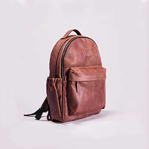 |
Stylish Leather Backpack | $250 | In Stock | 8% |
|
Table Striped Column
The Striped Column Table in Bootstrap adds alternating background colors to table columns for better readability. Use the .table-striped-columns class to apply this effect.
| ID | Coach | Phone | Student | Specialty | |
|---|---|---|---|---|---|
| 01 |
Emily Johnson |
emily.johnson@example.com | (123) 456-7890 |
|
Web Development |
| 02 |
Michael Smith |
michael.smith@example.com | (987) 654-3210 |
3+
|
UI/UX |
| 03 |
Alice Brown |
alice.brown@example.com | (555) 123-4567 |
|
Full Stack |
| 04 |
David Wilson |
david.wilson@example.com | (444) 321-9876 |
1+
|
Web Designer |
Striped Rows
The Striped Rows Table in Bootstrap adds alternating background colors to table rows for a cleaner look. Apply the effect using the .table-striped class.
| ID | Name | Phone | Status | |
|---|---|---|---|---|
| 01 | Emily Johnson | emily.johnson@example.com | (123) 456-7890 | Active |
| 02 | Michael Smith | michael.smith@example.com | (987) 654-3210 | Pending |
| 03 | Alice Brown | alice.brown@example.com | (555) 123-4567 | Active |
| 04 | David Wilson | david.wilson@example.com | (444) 321-9876 | Inactive |
Hoverable rows
The Hoverable Rows Table in Bootstrap highlights table rows when hovered. Use the .table-hover class to apply this effect.
| ID | Contact Information | Phone | Status |
|---|---|---|---|
| 01 |
Sarah Connorsarah.connor@example.com
|
(555) 765-4321 | Active |
| 02 |
John Doejohn.doe@example.com
|
(123) 987-6543 | Pending |
| 03 |
Jane Smithjane.smith@example.com
|
(321) 654-0987 | Active |
| 04 |
Chris Evanschris.evans@example.com
|
(987) 321-4567 | Inactive |
Table Dark
The Table Dark example in Bootstrap uses the .table-dark class to apply a dark background to the table, making the text stand out with lighter colors.
| ID | Customer | Date | Invoice |
|---|---|---|---|
| 05 | Emily Carter | Oct 05, 2023 | $1,200 |
| 06 | David Smith | Oct 12, 2023 | $2,750 |
| 07 | Sarah Johnson | Oct 15, 2023 | $4,000 |
| 08 | Michael Brown | Oct 20, 2023 | $5,600 |
Table Primary
The Table Primary example in Bootstrap applies the .table-primary class to give the table a blue background, following the primary theme color for a highlighted look.
| ID | Customer | Date | Invoice |
|---|---|---|---|
| 05 | Emily Carter | Oct 05, 2023 | $1,200 |
| 06 | David Smith | Oct 12, 2023 | $2,750 |
| 07 | Sarah Johnson | Oct 15, 2023 | $4,000 |
| 08 | Michael Brown | Oct 20, 2023 | $5,600 |
Active Table
The Active Table example in Bootstrap adds an active state to a specific row or cell using the .table-active class. This highlights the selected row or cell with a gray background.
| ID | Customer | Date | Invoice |
|---|---|---|---|
| 09 | Alice Green | Oct 22, 2023 | $1,500 |
| 10 | John Doe | Oct 25, 2023 | $3,200 |
| 11 | Linda White | Oct 30, 2023 | $2,800 |
| 12 | Robert Black | Nov 02, 2023 | $4,400 |
Table Small
The Table Small example in Bootstrap uses the .table-sm class to create a compact table. This reduces padding and makes the table more condensed, ideal for displaying data in a smaller footprint.
| ID | Customer | Date | Invoice |
|---|---|---|---|
| 1 | Michael Brown | Nov 05, 2023 | $2,000 |
| 2 | Sarah Johnson | Nov 10, 2023 | $1,750 |
| 3 | David Lee | Nov 12, 2023 | $3,100 |
| 4 | Emily Davis | Nov 15, 2023 | $4,500 |
| 5 | Chris Martin | Nov 20, 2023 | $2,300 |
| 6 | Amy Wilson | Nov 25, 2023 | $3,600 |
Vertical alignment
The Vertical Alignment example in Bootstrap demonstrates how to align table cell content vertically. You can use classes like .align-top, .align-middle, and .align-bottom to position content at the top, middle, or bottom of the cell, enhancing the table's readability and organization.
| Heading 1 | Heading 2 | Heading 3 | Heading 4 |
|---|---|---|---|
This cell inherits vertical-align: middle; from the table |
This cell inherits vertical-align: middle; from the table |
This cell inherits vertical-align: middle; from the table |
This here is some placeholder text, intended to take up quite a bit of vertical space, to demonstrate how the vertical alignment works in the preceding cells. |
This cell inherits vertical-align: bottom; from the table row |
This cell inherits vertical-align: bottom; from the table row |
This cell inherits vertical-align: bottom; from the table row |
This here is some placeholder text, intended to take up quite a bit of vertical space, to demonstrate how the vertical alignment works in the preceding cells. |
This cell inherits vertical-align: middle; from the table |
This cell inherits vertical-align: middle; from the table |
This cell is aligned to the top. | This here is some placeholder text, intended to take up quite a bit of vertical space, to demonstrate how the vertical alignment works in the preceding cells. |
Nested Table
The Nested Table example in Bootstrap shows how to create a table within another table. This allows you to organize complex data hierarchically. You can use the same Bootstrap table classes to style the nested table, ensuring a consistent look while presenting detailed information effectively.
| Item | Description | ||||||
|---|---|---|---|---|---|---|---|
| Item 1 |
|
||||||
| Item 2 |
|
Table Anatomy
The Table Anatomy example in Bootstrap illustrates the basic structure of a table. It includes essential elements like the table header <thead>, body <tbody>, and footer <tfoot>, showcasing how to organize data in a clear and readable format.
| # | Name | Role | Handle | Bio |
|---|---|---|---|---|
| 1 | Mark Otto | Developer | @mdo | Passionate about coding and open-source contributions. Enjoys hiking in his spare time. |
| 2 | Jacob Thornton | Designer | @fat | Creative graphic designer focused on user experience. Loves coffee and art. |
| 3 | Larry Bird | Community Manager | Engaging with the community to create meaningful connections. Avid reader and birdwatcher. | |
| Join our community and connect with these amazing individuals! | ||||