We have provided multiple variant options for the sidebar, making it very easy to customize. You need to change the attribute in the resources/assets/js/layout/layout-*.js file to switch between different sidebar color variations.
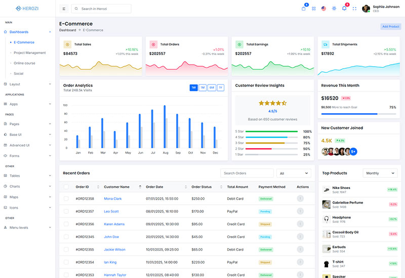
[ATTRIBUTES.SIDEBAR]: 'light-sidebar'
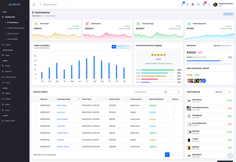
[ATTRIBUTES.SIDEBAR]: 'dark-sidebar'
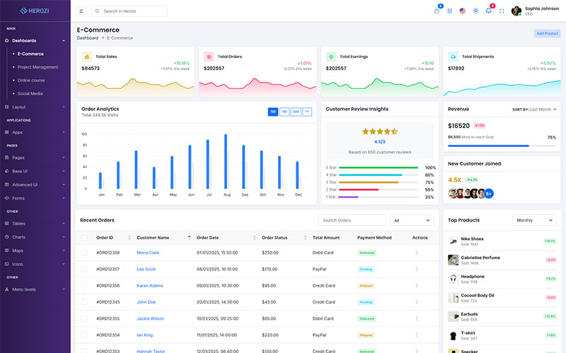
[ATTRIBUTES.SIDEBAR]: 'gradient-sidebar'
To change the sidebar variation, modify the [ATTRIBUTES.SIDEBAR] attribute in the configuration file located at resources/assets/js/layout/layout-*.js:
'light-sidebar''dark-sidebar''gradient-sidebar'To customize the sidebar colors, you need to modify the specific variation file (e.g., `light-sidebar`, `dark-sidebar`, or `gradient-sidebar`). This is where the sidebar’s background, text, and other color-related styles are defined.
Locate the variation file in the resources/assets/js/layout/ directory and adjust the CSS styles or color variables according to your needs.
Here's an example of how to set the default sidebar variation in the JavaScript configuration file:
const ATTRIBUTES = {
    SIDEBAR: 'data-sidebar',
};

const DEFAULT_VALUES = {
    [ATTRIBUTES.SIDEBAR]: 'dark-sidebar', // 'light-sidebar', 'dark-sidebar', 'gradient-sidebar'
};
By following these steps, you can easily switch between sidebar themes or modify the sidebar's colors to fit your requirements.
You can customize the sidebar colors by modifying the variables defined in the configuration. The available themes (light, dark, gradient) are controlled by these variables. To change the sidebar design or color scheme, you simply need to adjust the values of the variables.
All the sidebar color-related variables are located in the following file:
Admin/plugins/theme-colors/sidebarColors.js
// sidebar
$app-sidebar-base-width:                            240px;
$app-sidebar-small-width:                           120px;
$app-sidebar-title-color:                           #3e4853;
$app-sidebar-bg:                                    $white;
$header-submenu-bg:                                 $app-sidebar-bg;
$app-sidebar-bg-gradient:                           linear-gradient(to right, $purple-800, $purple-700);
$app-sidebar-slide-menu-width:                      224px;

// sidebar menu
$app-sidebar-menu-item-color:                       #5b6b79;
$app-sidebar-menu-item-active-color:                var(--#{$prefix}primary);
$app-sidebar-menu-item-hover-color:                 #{$app-sidebar-menu-item-active-color};
$app-sidebar-menu-item-active-font-weight:          500;

// sidebar left border
$app-sidebar-menu-left-line-border-width:           1px;
$app-sidebar-menu-left-line-border-style:           solid;
$app-sidebar-menu-left-line-border-color:           var(--#{$prefix}border-color);

// sidebar left dot
$app-sidebar-menu-left-dot-bg:                      #dbe0e5;
$app-sidebar-menu-left-dot-size:                    5px;
This approach allows you to adjust the sidebar colors and design by modifying variables for light, dark, or gradient color schemes. No cloning is required—just modify the existing variables as needed.
&[data-sidebar="light-sidebar"]{
    --#{$prefix}app-sidebar-border-color:                   #{$border-color};
    --#{$prefix}app-sidebar-menu-left-line-border-color:    #{$border-color};
}

&[data-sidebar="dark-sidebar"]{
    --#{$prefix}app-sidebar-menu-item-active-color:         #fff;
    --#{$prefix}app-sidebar-menu-item-hover-color:          #fff;
    --#{$prefix}app-sidebar-bg:                             #{tint-color($body-bg-dark, 2.5%)};
    --#{$prefix}app-sidebar-border-color:                   #424547;
    --#{$prefix}app-sidebar-menu-left-line-border-color:    #424547;
    --#{$prefix}app-sidebar-menu-item-color:                #{$gray-500};
    --#{$prefix}app-sidebar-title-color:                    #{$gray-400};
}

&[data-sidebar="gradient-sidebar"]{
    --#{$prefix}app-sidebar-bg:                             var(--#{$prefix}app-sidebar-bg-gradient);
    --#{$prefix}app-sidebar-menu-item-active-color:         #fff;
    --#{$prefix}app-sidebar-menu-item-hover-color:          #fff;
    --#{$prefix}app-sidebar-border-color:                   #{$gray-600};
    --#{$prefix}app-sidebar-menu-left-line-border-color:    #{$gray-600};
    --#{$prefix}app-sidebar-menu-item-color:                #{$gray-500};
    --#{$prefix}app-sidebar-title-color:                    #{$gray-400};
}

.slide-menu {
    background:                                             var(--#{$prefix}app-sidebar-bg-gradient);
}
Be the first to know about new updates and exclusive discounts. No spam, just great offers!
How about
With over 7 years of experienced team, we specialize in delivering custom projects for startups, blue-chip companies, and government agencies. We have successfully completed over 250+ projects, providing tailored solutions that meet the unique needs of each client.
Support© Herozi Design & Develop by Codebucks.