Avatar
Basic
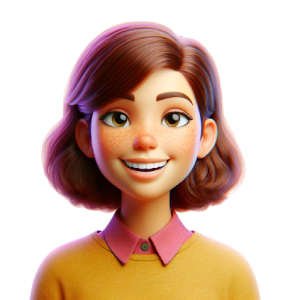
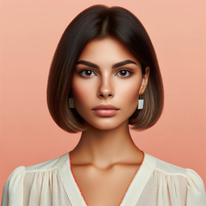
Avatar can be used for displaying image, icon, or character on square or circle shaped elements. Put image, icon, or character into .avatar-display. Look the example below.
Circle version
Extend default avatar element with .avatar-circle to change its shape to be circular.
Solid
You can use these by extending .avatar-{color} class to avatar element
Label
You can use these by extending .avatar-label-{color} class to avatar element
Border Avatar
Border Avatar adds a styled border around avatars whether they contain an image, icon, or character. Use .avatar-border along with size classes like .avatar-xs to display avatars with consistent bordered styles.
Border Circle Avatar
Border Circle Avatar displays avatars in a rounded (circle) shape with a visible border. You can use images, icons, or characters inside by combining .avatar-border with .avatar-circle for circular bordered styles.
Group
Avatar Group allows you to display multiple avatars together in a single stack. Wrap the avatars inside .avatar-group to create a grouped layout.
Group Sizing
Wrap a series of avatar elements into .avatar-group to group the elements. Instead of applying avatar sizing classes to every avatar in a group, just add .avatar-group-{lg|sm} to each .avatar-group
Sizing
If you want to change avatar size, you can use .avatar-{sm|lg} helper classes
Sizing
If you want to change avatar size, you can use .avatar-{sm|lg} helper classes
Sizing
If you want to change avatar size, you can use .avatar-{sm|lg} helper classes